Six workforce analytics metrics with formulas HR can act on now
Focus on six workforce analytics metrics, learn exact formulas and required data fields, set governance, and deploy dashboards that drive daily HR decisions.

Six metric groups cover almost every workforce decision you will make this year: performance, attendance, turnover, utilisation, scheduling KPIs and engagement. Track those, and you can answer the three questions that keep HR leaders up at night: are we overstaffed or understaffed, who is at flight risk, and where is labour cost leaking? Time Prof’s platform data, alongside ISO 30414 reporting standards, backs each metric group below.
TL;DR:
- Tracking attendance rate, schedule adherence, and voluntary turnover can expose most operational and cost issues within a quarter with minimal data points.
- Accurate calculation of metrics like absenteeism, utilisation, and overtime requires consistent definitions, look-back periods, and proper data sources to avoid errors.
- Linking each metric directly to specific business questions, such as labour cost reduction or service capacity improvement, ensures actionable insights and owner accountability.
- Using real-time data collection through integrated platforms like Time Prof reduces manual reporting, enhances decision speed, and simplifies compliance reporting.
- Emerging trends such as predictive flight-risk models, fatigue-aware scheduling, and standardized reporting frameworks will shape workforce analytics in the near future.
Table of Contents
- Essential workforce analytics metrics to track
- How to calculate each metric without getting the numbers wrong
- Matching metrics to the business question you’re actually asking
- Getting the data pipeline and governance right
- How Time Prof turns these metrics into daily decisions
- What actionable insight actually looks like in practice
- Where workforce analytics is heading next
- Author perspective: three pragmatic steps HR teams should take this quarter
- Try Time Prof and see these metrics update in real time
- Sources
Essential workforce analytics metrics to track
Most organisations drown in dashboards but starve for decisions. The fix is narrowing your focus to metrics grouped by the business problem they solve, not by which system happens to spit them out.
- Performance and quality: productivity per employee (output divided by hours worked) and error or quality rates, which flag training gaps before they become customer complaints.
- Attendance: attendance rate, absenteeism percentage, and punctuality, all of which shape rota reliability and client-facing consistency.
- Turnover and retention: total leavers, voluntary turnover rate, and retention rate by department, the trio that predicts recruitment cost spikes months ahead.
- Utilisation and capacity: productive utilisation, net available hours, and overtime percentage, the numbers that reveal whether you’re paying for idle time or burning staff out.
- Scheduling KPIs: shift fill rate, schedule adherence, and no-show rate, which directly affect service capacity and, per scheduling KPI analysis, revenue through missed bookings.
- Engagement and development: employee Net Promoter Score (eNPS), training completion rate, and skill coverage, the leading indicators for retention risk before someone hands in notice.
Most organisations track dozens of individual data points but genuinely act on only five or six, usually blending HRIS, time tracking, and survey data to build them. If you’re starting from nothing, begin with attendance rate, schedule adherence, and voluntary turnover. Those three alone expose most operational and cost problems within a single quarter.
How to calculate each metric without getting the numbers wrong
Formulas look simple until two managers calculate the same metric two different ways and get two different answers in the same board meeting. Precision here is not pedantry, it is what makes a dashboard trustworthy.
- Absenteeism rate = (Total absence days ÷ Total available workdays) × 100. Requires headcount, contracted days, and confirmed absence records.
- Voluntary turnover rate = (Voluntary leavers ÷ Average headcount over the period) × 100. Requires start dates, leave dates, and a leaver reason code separating voluntary from involuntary exits.
- Utilisation rate = (Productive hours ÷ Total contracted hours) × 100. Requires actual worked hours from time and attendance data, not scheduled hours, which routinely overstates capacity.
- Schedule adherence = (Shifts worked as scheduled ÷ Total scheduled shifts) × 100. Requires shift status flags: on time, late, swapped, or no-show.
- Overtime percentage = (Overtime hours ÷ Total hours worked) × 100. Requires payroll-verified overtime, not rota-estimated overtime, since the two rarely match.
- Shift fill rate = (Shifts successfully staffed ÷ Total shifts published) × 100. Requires open-shift and shift-claim timestamps.
Three pitfalls wreck these calculations more often than any formula error. First, inconsistent headcount definitions: full-time equivalents versus headcount produce wildly different turnover percentages for the same business. Second, mixed look-back periods, comparing a rolling 12-month turnover figure against a fixed calendar-year absenteeism figure makes trend lines meaningless. Third, double-counting paid versus worked hours, particularly around annual leave and bank holidays, which inflates utilisation figures if leave hours get logged as productive time.
Matching metrics to the business question you’re actually asking
A dashboard with forty tiles solves nothing if nobody knows which tile answers which question. Work backwards: start with the decision, then pick the metric, then assign an owner.
- Reducing labour cost → track net available hours and overtime percentage → owned by operations managers → reviewed weekly.
- Improving service capacity → track utilisation rate and backlog hours → owned by team leads → reviewed weekly.
- Lowering turnover → track retention rate and flight-risk indicators (declining eNPS, rising lateness, reduced shift-swap requests) → owned by HR business partners → reviewed monthly.
Set your baseline by measuring for two to four weeks before judging performance against it. Then define RAG (red, amber, green) thresholds off that baseline rather than an industry average, since thresholds set against your own operating pattern flag genuine anomalies faster than generic benchmarks ever will.
Pro Tip: Review cadence should match decision speed, not reporting convenience. If overtime spend can spiral in a fortnight, review it weekly, not at the monthly board pack.
Getting the data pipeline and governance right
Metrics are only as good as the systems feeding them. Four sources typically need to talk to each other: your HRIS, payroll, time and attendance system, and rota or scheduling platform, with engagement survey tools feeding in less frequently.
- Build dashboards in layers: top-level KPIs for leadership, filterable segments (by site, team, shift pattern) for operations managers, and alert thresholds that flag deviations automatically rather than waiting for someone to notice a trend.
- Assign clear ownership per metric, since a KPI nobody owns is a KPI nobody acts on.
- Apply access controls and a defined retention policy for people data, and be transparent with staff about what is measured and why, in line with Gov on employer responsibilities.
- For hybrid or remote teams, attendance tracking needs a different approach entirely, endpoint activity or self-reporting rather than clock-in badges, and it carries its own privacy considerations worth flagging to staff upfront.
Timeprof’s workforce visibility guidance covers this governance layer in more depth if you’re building a policy from scratch.
How Time Prof turns these metrics into daily decisions
Time Prof was built around the idea that workforce data should sit in one place, not scattered across a rota spreadsheet, a clocking app, and a separate HR system. The platform captures most of the metrics above as a byproduct of daily operations rather than a separate reporting exercise.
- Intelligent shift planning logs schedule adherence and shift fill rate automatically as shifts are published, claimed, and worked.
- Real-time attendance tracking with optional geofenced clock-in captures punctuality and absenteeism without manual timesheet reconciliation.
- Multi-site dashboards roll utilisation, overtime percentage, and net available hours up to a single view across every location.
- Audit-ready compliance reports export the same figures your board or regulator asks for, formatted and timestamped.
Operationally, this tends to mean fewer rota errors, less time spent chasing timesheets, and reports that are ready the moment someone asks for them rather than assembled overnight.
What actionable insight actually looks like in practice
A metric only earns its place on a dashboard if it changes what someone does next. A retail manager who notices schedule adherence dropping on Sunday shifts specifically, not overall, can investigate whether the rota itself is the problem, perhaps too few experienced staff assigned to the busiest slot, rather than assuming a general discipline issue.
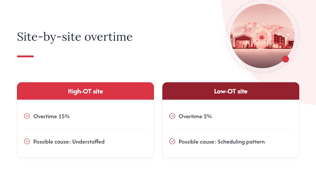
A care provider tracking overtime percentage by site might spot that one location consistently runs 15% over its contracted hours while a comparable site runs at 2%. That gap points to either understaffing on paper or a scheduling pattern that quietly relies on overtime to cover gaps, both fixable once visible. Timeprof’s workforce data in care settings piece walks through exactly this kind of site-by-site comparison.
Turnover data segmented by manager, rather than by department alone, often reveals that retention problems cluster around specific line managers rather than roles or pay bands. That reframes an HR retention project into a management coaching conversation instead.
And a security firm watching no-show rate by shift type might discover night shifts have double the no-show rate of day shifts, a pattern that justifies a shift premium or a stricter confirmation process rather than blanket recruitment. The insight isn’t the number itself, it’s the decision the number forces you to make.
Where workforce analytics is heading next
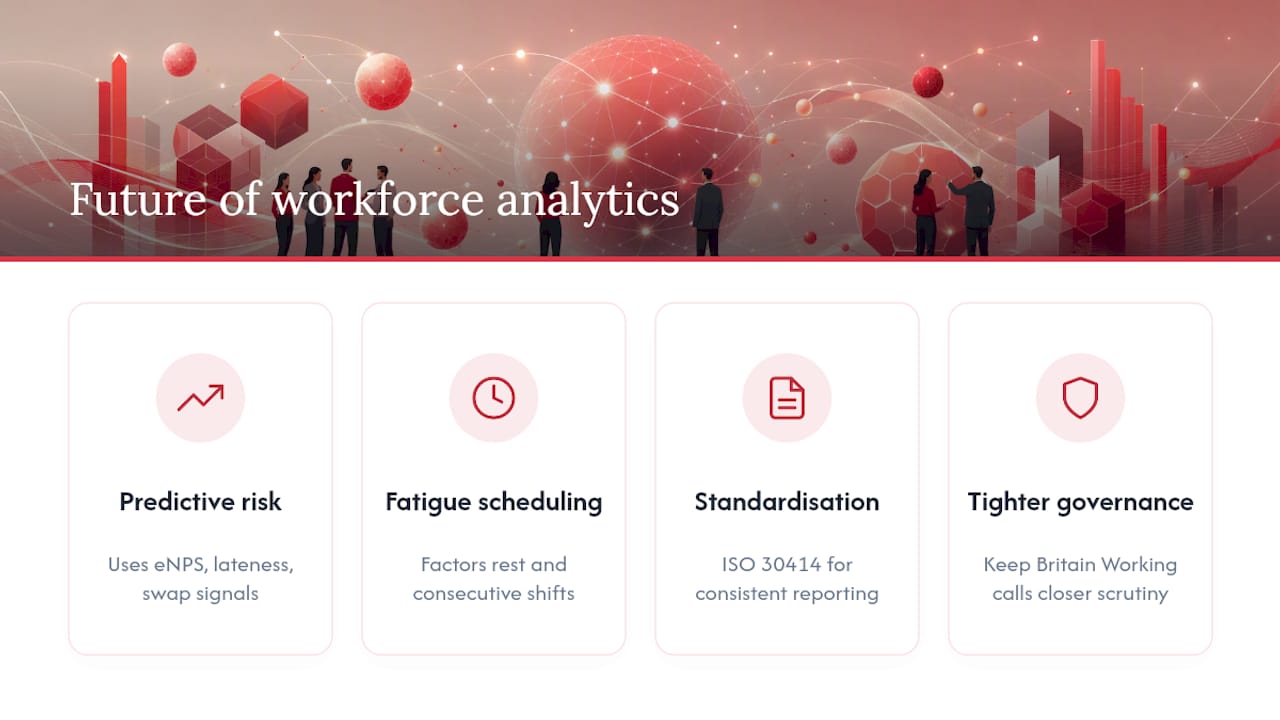
Predictive flight-risk modelling is moving from enterprise HR teams into mid-sized businesses, using patterns like declining eNPS scores, rising lateness, and fewer voluntary shift swaps to flag resignation risk weeks before it happens rather than reading it in an exit interview.
Fatigue-aware scheduling is another shift gathering pace: rather than just filling shifts, systems increasingly factor in rest periods and consecutive shift patterns to reduce burnout-driven absenteeism and errors, particularly in care and security work where fatigue has safety implications.
Standardisation is catching up too. ISO 30414 is pushing organisations toward consistent human capital reporting definitions, which matters enormously once you’re comparing metrics across sites, franchises, or after a merger, where “turnover rate” has historically meant three different calculations in three different spreadsheets.
Expect governance to tighten as well. The Keep Britain Working review points toward closer scrutiny of workforce resilience and labour practices, which means the metrics you track today may need to double as evidence of fair, transparent management tomorrow, not just operational efficiency.
Author perspective: three pragmatic steps HR teams should take this quarter
Pick three metrics that answer your single biggest question this quarter, not twelve that answer none decisively. Baseline them for two weeks before judging anything. Set one weekly fifteen-minute review meeting, no more, and invite the manager who owns the number.
Tell staff what you’re measuring and why before they find out from a dashboard screenshot. Trust evaporates fast when analytics feel like surveillance rather than support.
— Michael
Try Time Prof and see these metrics update in real time
Time Prof pulls scheduling, attendance, and compliance data into one dashboard, so the metrics covered above stop being a monthly spreadsheet exercise and start updating as shifts happen.
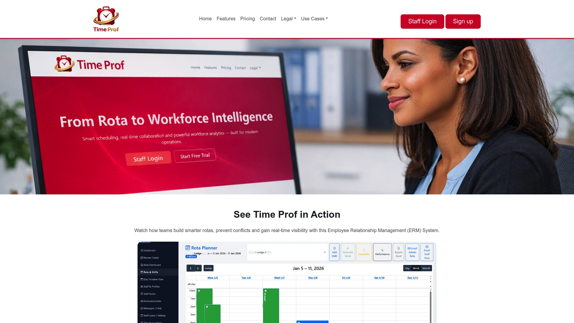
If you’re currently piecing utilisation and overtime figures together from separate systems, a live demo shows how much of that manual work disappears once rota, clock-in, and reporting sit on one platform. Visit Time Prof to book a demo or start a trial and see your own workforce data populate the dashboards discussed here within days, not quarters.