How operational reports improve decisions: a manager's guide
Discover how operational reports enhance decision-making by transforming raw data into actionable insights, enabling timely and effective management.

Operational reports improve decisions by turning raw activity data into a finding, an interpretation, and a recommendation a manager can act on the same day. Without that chain, data just sits there. With it, a rota gap, a slow shift, or a stock shortfall becomes something you can fix before it costs money.
The mechanism is simple once you see it: timely data reduces the guesswork behind a choice, and interpretation removes the need for a manager to reconstruct context from scratch every time. That’s the whole value proposition of operational reporting, and it’s why the format of a report matters almost as much as the numbers in it.
Here’s what a well-built operational report actually does for you:
- Cuts the time between a problem appearing and a decision being made
- Replaces gut-feel judgement calls with a documented baseline and trend
- Makes trade-offs visible, so you can compare two options on the same terms
- Lets you monitor whether a past decision actually worked
- Flags exceptions early, before they become incidents
- Gives every level of the business a consistent version of events
The rest of this guide covers the mechanics: what separates operational reporting from strategic dashboards, the report types worth building, and a template you can apply in under an hour.
Key Takeaways
Operational reports improve decisions when they combine timely, accurate data with a stated interpretation and a specific, owned recommendation.
| Point | Details |
|---|---|
| Follow the three-step chain | Structure every report as finding, interpretation, then recommendation, or it won’t drive action. |
| Design backwards from the decision | Cut any metric that wouldn’t change what someone does if it moved. |
| Cap main findings at five | Push detail into an appendix and keep the headline report short enough to act on. |
| Track usage, not just output | Low take-up or unused reports (echoing the 70-of-2,000 pattern) signal it’s time to prune. |
| Use TimeProf for live, consistent data | TimeProf’s real-time feeds and role-based views cut decision latency and keep definitions consistent across sites. |
Table of Contents
- What counts as operational reporting?
- Report types managers rely on most
- How the findings-to-recommendation chain actually works
- What every decision-ready report needs
- Best practices for making reports decision-ready
- How to prepare a decision-oriented report in under an hour
- Measuring whether your reports are actually working
- Common pitfalls and the red flags that mean it’s time to redesign
- A short before-and-after with TimeProf
- Put decision-ready reporting on autopilot with TimeProf
- Frequently asked questions
- Sources
What counts as operational reporting?
Operational reporting covers the reports that support day-to-day and week-to-week running decisions, not long-range planning. Think shift performance, appointment throughput, stock levels, or agent handling times, refreshed daily or weekly and read by team leads and department managers rather than boards.
Strategic and analytical reporting sit at a different altitude. A strategic report might ask whether to open a second site next year; an analytical report might explore why churn rose across a whole quarter. An operational report asks a narrower, more urgent question: should this shift be covered tomorrow, and by whom?
The distinction matters because mixing the two produces reports that are too slow for daily use and too shallow for planning use.
| Aspect | Operational reporting | Strategic/analytical reporting |
|---|---|---|
| Cadence | Daily or weekly | Monthly, quarterly, or ad hoc |
| Audience | Team leads, supervisors, line managers | Senior managers, directors, boards |
| Time horizon | Immediate, this week | Months to years ahead |
| Typical question | “What do we do tomorrow?” | “What should we invest in next year?” |
Both have their place. This guide focuses on the operational layer, because that’s where most missed decisions actually happen.
Report types managers rely on most
Different report types map onto different recurring decisions. Knowing which one you need saves you building a bespoke report every time a question comes up.
- Time-spent-by-service reports show where staff hours actually go, supporting decisions about which service lines to staff up or wind down.
- Appointment utilisation reports reveal gaps between booked and attended slots, driving decisions on scheduling buffers and no-show policies.
- Staff utilisation reports compare rostered hours against actual demand, feeding staffing and rota decisions directly.
- Inventory reorder reports flag stock approaching threshold, triggering purchase-order timing decisions.
- Production throughput reports track output against target by shift or line, informing decisions on process bottlenecks or overtime approval.
- Customer service agent metrics (handling time, resolution rate, backlog) support escalation and routing decisions in real time.
Each of these ties to a specific action, not just an observation. A types of workforce management reports breakdown is worth reviewing if you want a fuller map of which report fits which recurring decision in your own operation. The pattern that matters here: a good report answers a question someone was already asking, rather than generating a new one.
How the findings-to-recommendation chain actually works
A report only changes a decision when it walks a manager through three linked steps: a finding, an interpretation of that finding, and a recommendation for what to do about it. Skip any one link and the report becomes either a data dump or an opinion with no evidence behind it. Guidance on reports that support professional decisions makes this connection explicit: the interpretation is what links a fact to an action, and without it, the fact alone rarely moves anyone.
Two other factors sit alongside that chain. Decision latency is the gap between an event happening and a report surfacing it. A weekly report on a staffing shortfall that happened on Monday is nearly useless by Friday. Data freshness and context determine whether the number means anything at all. A 15% variance is meaningless without knowing the baseline, the threshold, and what happened last time it moved that far.
Here’s a small example of the chain in practice. A supervisor notices, via a daily utilisation report, that one site is running 20% understaffed against forecast demand every Tuesday. The interpretation: Tuesday demand has shifted upward over the past six weeks, but the rota template hasn’t been updated to reflect it. The recommendation: add one shift to the Tuesday rota template for the next four weeks and monitor utilisation against the new baseline.

Pro Tip: If a report only tells you what happened, ask the person building it to add one sentence answering “so what should change?” That single sentence is usually the difference between a report that gets filed and one that gets acted on.
What every decision-ready report needs
Every effective operational report shares the same skeleton, regardless of industry. Miss one of these components and the report either confuses the reader or leaves the decision to guesswork.
- A headline finding, stated in one sentence, at the top
- The relevant KPI shown against its baseline, not in isolation
- A variance or threshold marker, so the reader knows whether the number is a problem
- A trend line, because a single data point without direction tells you almost nothing
- A short interpretation of why the number moved
- A specific recommendation, with an owner and a deadline attached
| Component | Purpose | Failure mode if missing |
|---|---|---|
| Headline finding | Orients the reader in seconds | Report gets skimmed and shelved |
| KPI with baseline | Shows whether the number is good or bad | Reader can’t judge significance |
| Variance/threshold | Flags exception vs. normal range | Every number looks equally urgent |
| Trend | Shows direction, not just a snapshot | Reactive, one-off decisions |
| Interpretation | Explains the “why” | Follow-up questions, delayed action |
| Recommendation + owner | Converts insight into action | Report read, nothing changes |
Data quality underpins all of this. Decision-ready operational data needs to be timely, accurate, contextually relevant, complete, and drawn from a single connected source rather than three spreadsheets that don’t quite agree. On the visual side, one chart per finding beats a dashboard with fifteen widgets: highlight the exception, mark the threshold, and cut everything that doesn’t change the reader’s decision.
Best practices for making reports decision-ready
Most reports fail not because the data is wrong, but because nobody designed them around a decision in the first place.
- Start from the decision, not the data. Ask what choice this report is meant to support, then work backwards to the metrics that actually move that choice. Decision-oriented report design guidance suggests testing every metric with one question: what would change if this number moved? If nothing would, cut it.
- Keep the main report to a handful of findings. Cap it at around five, each backed by a single chart, and push detailed tables into an appendix for the people who want to dig deeper.
- Write the interpretation into the report itself. Leaving analysis for a follow-up meeting doubles the time between finding and decision, and often kills the decision entirely.
- Name an owner and a success criterion for every recommendation. A recommendation with nobody attached to it is a suggestion, not a decision aid.
- Match cadence to decision frequency, not habit. A staffing report needs daily visibility; a supplier contract review doesn’t need weekly updates just because that’s the template everyone inherited.
Pro Tip: Try an exception-based layout: instead of listing every metric, show only the ones that have crossed a threshold this period. It cuts reading time roughly in half and forces attention onto what actually needs a decision.
A workable layout: headline finding at the top, two or three supporting metrics with trend arrows underneath, then a boxed recommendation with an owner’s name. Everything else goes in an appendix.
How to prepare a decision-oriented report in under an hour
- Define the decision the report needs to support, in one sentence.
- Choose two to four KPIs that would actually change if the decision went a different way.
- Validate the data source, checking for gaps, duplicate entries, or stale timestamps.
- Analyse the trend and variance against a known baseline.
- Interpret the “why” behind the number in a sentence or two.
- Write the recommendation, with an owner and a review date.
- Distribute to the audience who can actually act on it, not everyone on the mailing list.
A mini template worth keeping on hand: headline, the question being answered, date range, key findings (five maximum), interpretation, recommendation, owner, and an appendix for raw figures. Automate the data pull and the chart; keep the interpretation and recommendation written by a person who understands the context, at least until the pattern is well established enough to codify into a rule.
Measuring whether your reports are actually working
You can’t tell if a report is earning its place unless you track how it’s used, not just how it looks.
| Metric | What it tells you | Timeline to check |
|---|---|---|
| Decision latency | Time from event to decision made | Weekly, short-term |
| Action take-up rate | Share of recommendations actually acted on | Monthly |
| Forecast accuracy | How close projections came to actuals | Quarterly |
| Process exception rate | Frequency of threshold breaches | Weekly |
| Time spent producing reports | Hours saved once reporting is streamlined | Monthly |
Report proliferation is a real and underappreciated risk here. One enterprise system tracked over 2,000 custom reports, of which only around 70 had actually been run in 90 days. That’s a strong signal: usage data itself is one of the best diagnostics for whether reporting effort is going where decisions actually get made.
Common pitfalls and the red flags that mean it’s time to redesign
Most reporting failures repeat across industries, and most have a fast fix.
- Stale data breeds mistrust fast. Fix: connect the report to a live feed instead of a manual weekly export.
- Too much detail buries the decision. Fix: move raw tables to an appendix.
- Inconsistent definitions (“utilisation” meaning three different things across teams) cause arguments, not decisions. Fix: agree one glossary.
- No recommendation attached leaves interpretation to chance. Fix: require a one-line action on every report.
- Excessive cadence trains people to stop reading. Fix: match frequency to how often the decision actually changes.
Watch for low engagement or a flood of clarifying questions after distribution. Both are signs a report needs pruning, not more data.
A short before-and-after with TimeProf
One care operator using TimeProf’s real-time workforce visibility moved from a weekly, manually compiled staffing report to a live dashboard refreshed continuously through the shift. The change itself was straightforward: automated data feeds replaced spreadsheet exports, and a named site manager owned the exception alerts.
The outcomes worth noting:
- Staffing gaps flagged the same shift, not the following week
- Fewer last-minute cover incidents, because shortfalls surfaced before the shift started
- One consistent utilisation figure shared across sites, replacing three conflicting spreadsheets
What managers actually say they need
“Give me the one number that’s wrong and tell me what to do about it” is the closest thing to a universal request from managers reviewing operational reports. Speed and a clear next step beat completeness almost every time.
That preference maps directly back to the checklist earlier: a headline finding, one interpretation, one recommendation. Managers rarely ask for more data. They ask for less friction between the number and the decision.
Put decision-ready reporting on autopilot with TimeProf
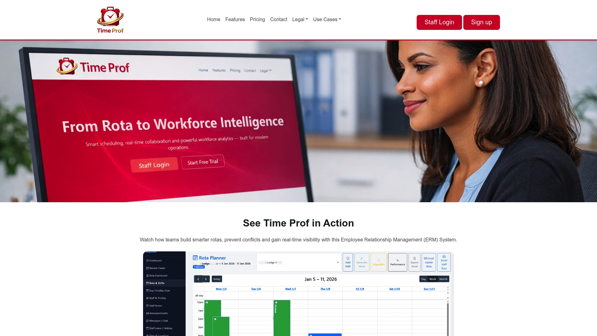
TimeProf gives managers the real-time data feed that decision-ready reporting depends on, without the manual exports and mismatched spreadsheets that slow everything down. Because scheduling, attendance, and site data all live in one platform, the reports it generates share one consistent set of definitions across every site, so a “utilisation” figure means the same thing whether a supervisor reads it or a regional manager does.
Three ways it changes what a report can do for you:
- Real-time data feeds replace the weekly export, cutting decision latency from days to hours.
- Consistent, role-based views mean a site manager and a regional director look at the same underlying figures, filtered to what each of them needs to act on.
- Audit-ready reporting keeps a record of what was flagged, when, and what was decided, useful for compliance reviews and for proving a change worked.
If your current reporting still runs on spreadsheets and a Friday email, take a look at the TimeProf platform and see what a live operational report looks like against your own rota and site data.
Frequently asked questions
How do operational reports improve decisions if managers are already busy reviewing dashboards? They cut the time spent interpreting raw numbers by presenting the finding, the reason behind it, and a recommendation together, so a manager doesn’t have to reconstruct context from scratch.
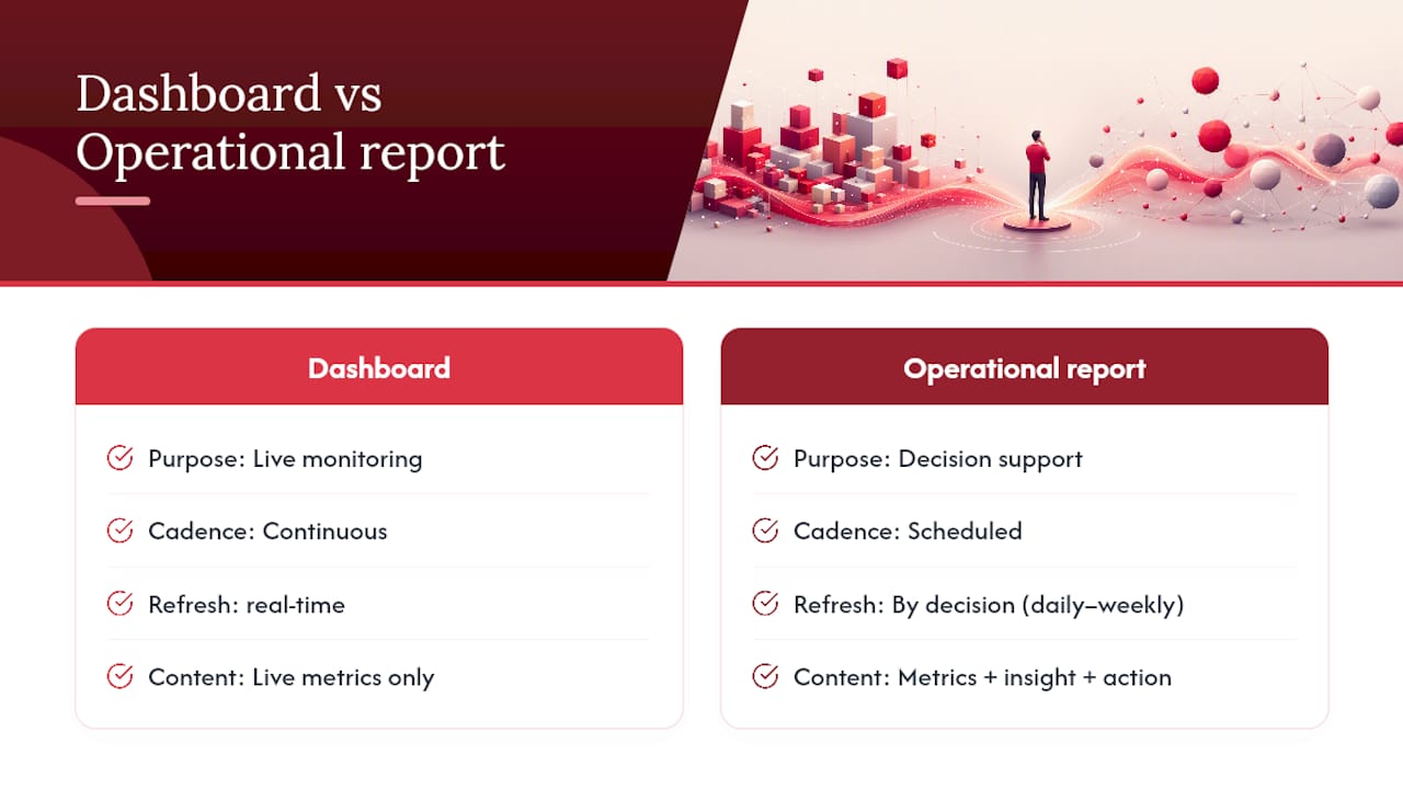
What’s the difference between an operational report and a KPI dashboard? A dashboard displays live metrics continuously; an operational report packages a subset of those metrics with interpretation and a recommendation at a set cadence, built to support a specific decision.
How often should operational reports be refreshed? Match the refresh rate to how often the decision itself can change. Staffing and service-level metrics often need daily or real-time updates, while inventory reorder points might only need weekly review.
What is the biggest mistake managers make with operational reports? Treating them as data summaries rather than decision tools. A report with no recommendation and no owner rarely changes anything, no matter how accurate the numbers are.
Sources
- Reports that support professional decisions — LibreTexts
- The impact of operational reporting on decision-making | Guidewire blog
- Decision-oriented report design — Onetribe Advisory
- Why better operational data leads to smarter decisions — VersaCloud ERP